Week 11: Maps & Cartography
Introduction
Up until now, we have only created non-spatial visualizations. In many cases, including our HDB resale data, data points have an explicit or implicit spatial reference. This information can be used to visualize the spatial aspects of a dataset. Sometimes this is just a useful way of presenting information, but often it can be an essential step in deriving insight from a visualization. This week, we will create a series of maps based on our previous HDB resale data. In doing so, you will learn how the grammar of graphics can be extended to spatial visualizations.
Cartography vis-a-vis the grammar of graphics.
Although the act of map making (cartography!) has much older roots than the concept of the 'grammar of graphics', the two are very much compatible. With some extensions, the grammar of graphics can also be used to create maps of any kind. florence supports the visualization of spatial information for a wide variety of marks out-of-the-box but there are two specific concepts to take into account before we get our hands dirty.
Data format
To make data 'spatial', we need some way to encode the spatial attributes of each observation (often referred to as geometry). There are many different file formats that allow you to do so (e.g. the Shapefile is a mainstay in desktop GIS). In online mapping, GeoJSON is the defacto standard. It is an extension of regular json according to a specific specification. For a spatial point that might look like this:
{
  "type": "Feature",
  "geometry": {
    "type": "Point",
    "coordinates": [125.6, 10.1]
  },
  "properties": {
    "name": "Dinagat Islands"
  }
}
A 'Feature' has two additional keys: geometry, holding information about the spatial attributes; and properties, holding any additional non-spatial attributes. Our familiar florence-datacontainer library can read and interpret this information straight out of the box. It does this by converting all properties to regular columns and storing all geometry-related information in a special $geometry column (the $ indicates it is a special column – and you shouldn't manually touch it). If you are familiar with spatial data in the tidyverse, this is similar to how sf stores geometry data in a tibble.
Scales
A second important particularity is that all maps are projections. They represent the three-dimensional globe on a two dimensional plane. This can be done in all kinds of ways that all have their own pros and cons (see Chapter 5 of Making Maps). In some cases, data is recorded in three-dimensional 'earth' coordinates while in other cases data might already be pre-projected in a two-dimensional plane for you. Even in this latter case, you still need to ensure that the spatial coordinates translate neatly to screen coordinates. To do this, we can no longer treat the x and y dimension separate but must take them into account together. To aid in this, florence exports a createGeoScales utility that, given the domain/bounding box in the following form {x: [min, max], y: [min, max]}, will return an object with two scales in the following form {scaleX: // scaleX here //, scaleY: // scaleY here //}. You can spread the resulting object on the appropriate Graphic or Section.
A simple map to get started
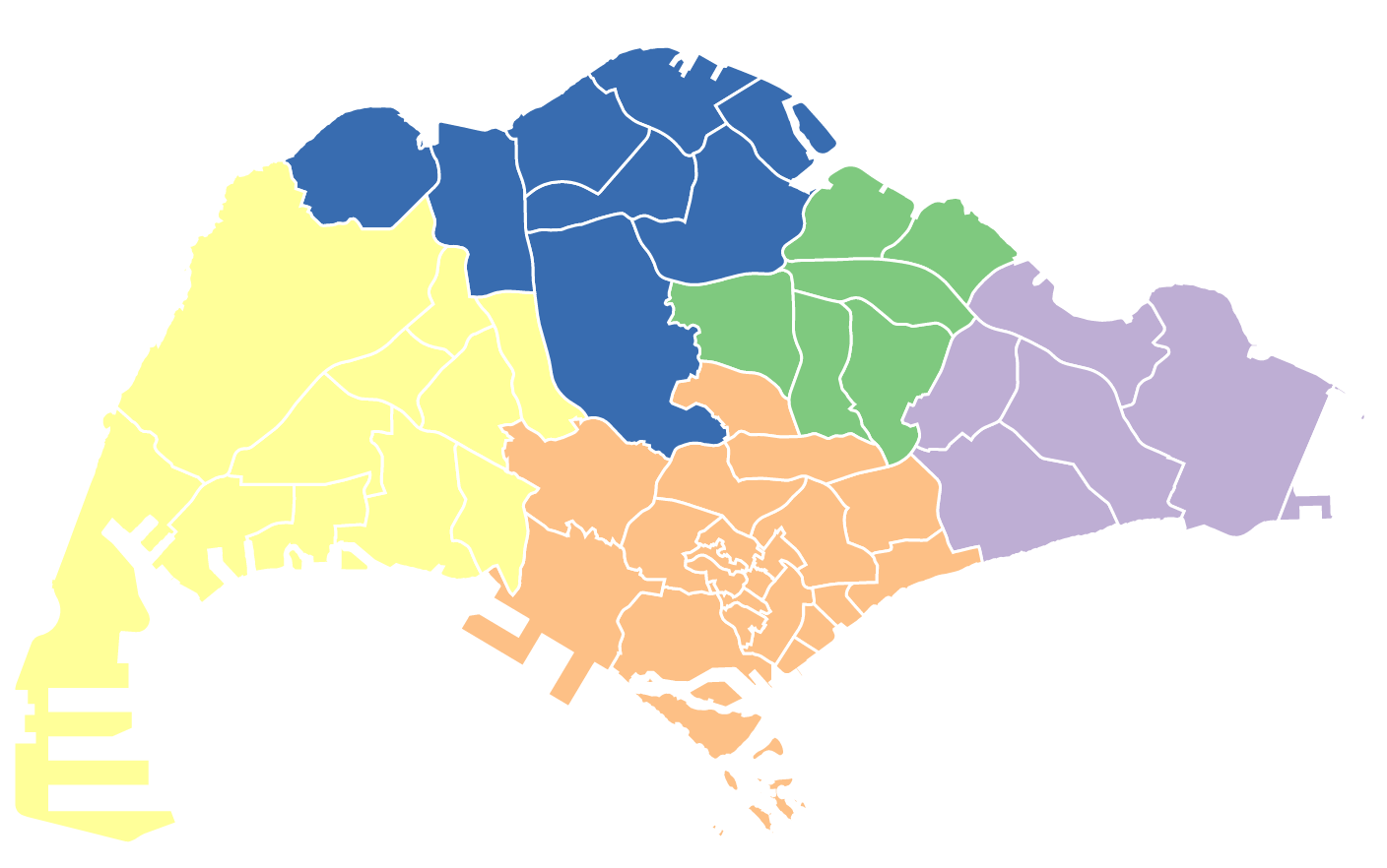
In this section, we will start with creating a simple map of Singapore's planning areas. Our immediate goal is just to draw the correct shapes on the page. To get you started, you can use the sandbox below.
As you can see, the planning area data is exported from a file called planning_areas.js. The inside of that file looks like this:
{
    type: 'Feature',
    geometry: { type: 'Polygon', coordinates: [[[30690.25, 42006.253900000826], [30709.29889999982, 41944.33970000036], [30751.857300000265, 41675.00779999979], [30759.125, 41447.59380000085]]] // snip },
    properties: { OBJECTID: 1, PLN_AREA_N: 'ANG MO KIO', PLN_AREA_C: 'AM', CA_IND: 'N', REGION_N: 'NORTH-EAST REGION', REGION_C: 'NER', INC_CRC: 'E5CBDDE0C2113055', FMEL_UPD_D: '2016/05/11', X_ADDR: 28976.8763, Y_ADDR: 40229.1238, SHAPE_Leng: 17494.2401897, SHAPE_Area: 13941379.9943 }
    }
As you now know, this structure is called GeoJSON – and florence-datacontainer should be able to read it in without a problem. The planning area data is already imported at the top of the App.svelte file. Your goal is to simply draw a map of all planning areas in Singapore. To do so, we will walk through the usual steps of creating a visualization with the grammar of graphics, with some special attention to the special spatial aspects.
- Convert the planning area data to a DataContainer
- Create the right 'position' scales (hint: use the
createGeoScalesfunction) - 'Spread' the position scales on the
Graphicso that all marks within it can be positioned in 'data space' - Create a Mark layer that displays the right polygon for each planning area (hint: use the
geometryproperty instead of separate x and y properties)
We will do this section in class together.
Solution
Choropleth maps – applying color
As is discussed in VAD Chapter 8, with spatial data we generally need to reserve the positional channels to visualize the spatial aspects of our data (i.e. make sure that planning areas show up on the page with the right shape and in the right location). But this leaves many other channels still open to help visualize other aspects of our dataset.
A classic way that this is done in cartography is often referred to as the choropleth map: we vary the fill color (or pattern) of each polygon based on some underlying attribute in the data. We have seen some examples of this in Du Bois' Paris exhibit in the first half of the term!
In this section, we will extend the somewhat boring black and white map of our planning areas and color each planning area based on the region it is in. To do this, we need to work with a new type of scale that allows us to 'map' region names to specific colors (cf. VAD Chapter 10). Our region names are a categorical variable. So far we have relied on d3 scales designed for continuous data, but luckily it also has scales for categorical variables. They are – somewhat misnamed – called ordinal scales in the familiar d3-scale library.
Apart from the scale function itself, we also need a set of colors to map to. Although we could certainly come up with a set of colors ourselves, especially in the early stages of visualization, it is often useful to rely on some built-in sensible defaults. For this purpose, we can use the d3-scale-chromatic library. It provides both categorical and continuous color scales – mostly based on the excellent work by Cynthia Brewer's team on ColorBrewer.
The library, and the necessary imports have already been set up in your App.svelte file. To create our desired choropleth map, we need to do the following steps:
- Set up our 'ordinal' color scale – using the domain from the
REGION_Ncolumn and setting the range based on theschemeAccentcolor scheme. - Set the
fillproperty of the polygons. Although for positional properties the scale gets applied automatically, here we have to make sure the scale is applied to each value in the dataset (hint: use the map method)
We will create a video to walk through these steps.
Solution
Choropleth maps – but now with hexagons
Our ultimate goal is to visualize the spatial distribution of resale prices in Singapore. To do so, we will change th unit of analysis from planning areas (they're quite large!) to smaller hexagonal cells. This data is already provides in the hex_grid.js file in your sandbox.
To make sure, we're comfortable with foundational material in the previous sections, we'll repeat the steps to create a map of Singapore's regions with the hexagonal grid first. The end result should look something like this:
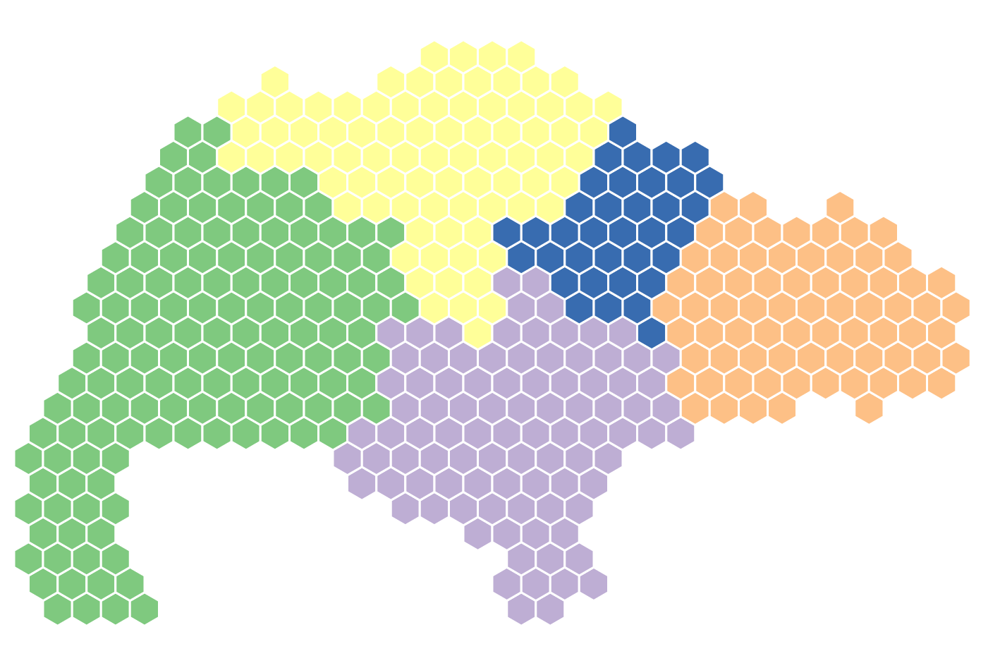
To achieve this, you will have to switch out the planning area data with the hexagonal grid (make sure to have a look at the datacontainer via console.log to see what other variables are available). The steps to visualize this map look like:
- Create datacontainer based on hex data.
- Create spatial geoScale to 'spread' to
scaleXandscaleYproperties of theGraphic. - Create ordinal color scale to map region name to specific color.
- Apply the correct properties on the
PolygonLayer
We will create a video to walk through these steps.
Solution
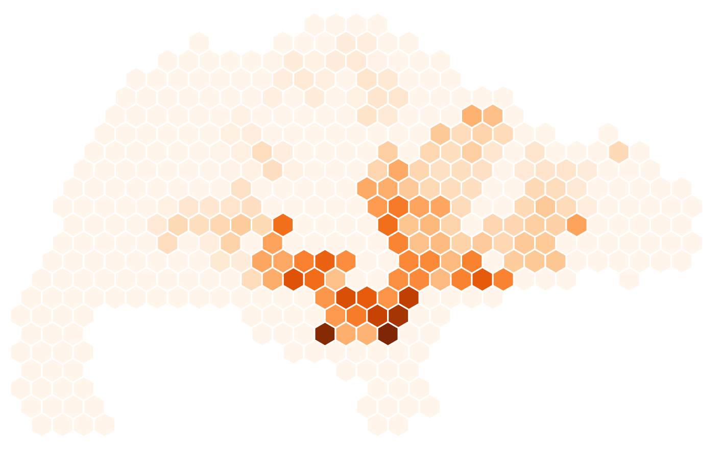
Choropleth maps with continuous data
Now that we have the foundation of a choropleth map based on our hexagons, the next step is to change the categorical 'region name' with the continuous mean_price variable. This is the average price per square meter for resale transactions in that location.
To achieve this, we will:
- Change our ordinal scale with a sequential scale.
- Change our color scheme to a sequential scheme as well. Instead of supplying this to the
rangeof the scale, we will supply it to theinterpolatormethod instead. - Change the domain of the scale to the appropriate
mean_pricedomain.
We will create a video to walk through these steps.
Solution
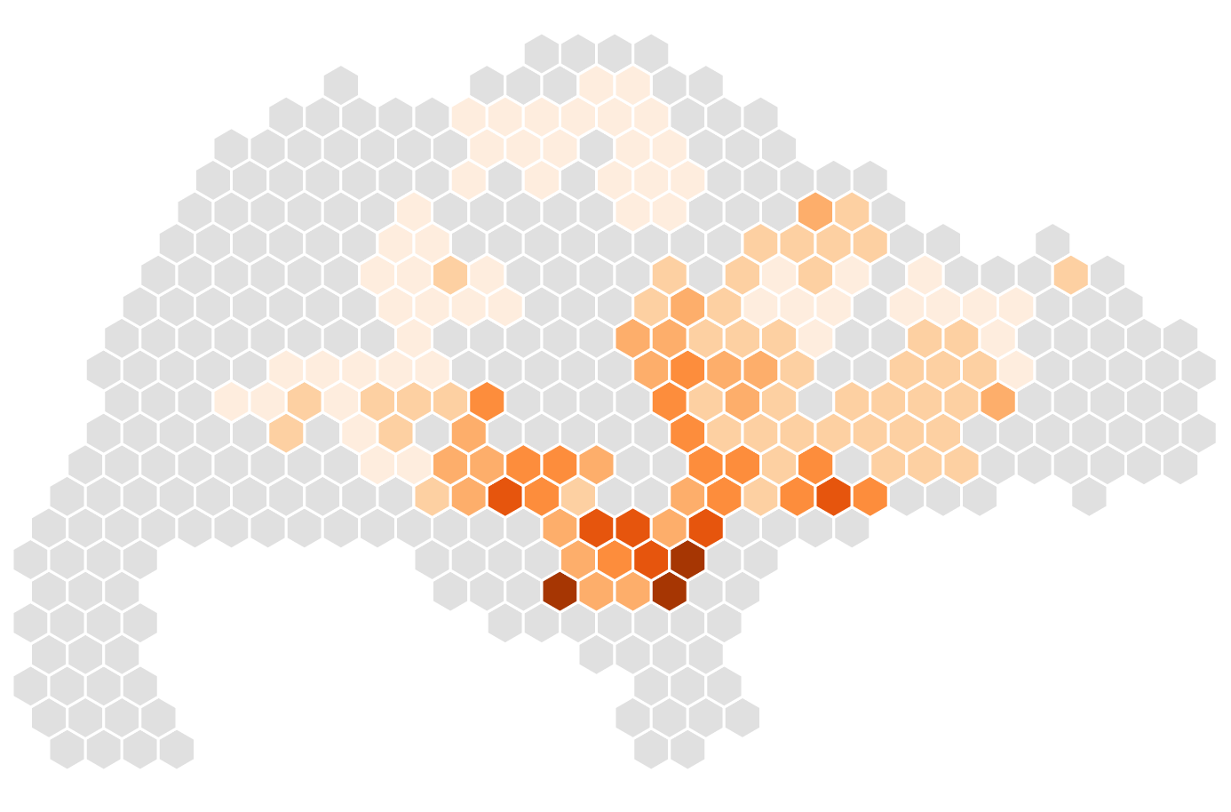
Choropleth maps with class breaks
Although it was relatively straightforward to set up a continuous/linear scale in the previous section, in practice cartographers often choose to classify or 'bin' such data in a limited (generally 9 or less ) number of classes (cf. Making Maps Chapter 8). This can make it easier for the reader to see specific patterns and gain insight.
To do this in JavaScript, we have to use yet another d3 scale: the threshold scale. This scale allows us to set a specific number of class breaks.
To achieve this, we will:
- Use the DataContainer's
.binmethod to construct 6 bins with the appropriate classification scheme (we will useEqualIntervalfor now). - Convert the resulting bin information to the threshold structure that the threshold scale expects.
- Pick a sequential color scheme with a specific number of colors, to assign to the
rangeof the scale.
We will discuss and do this during Thursday's class together.
Solution
Replicating Making Maps' classification comparison
In the final section, we will extend the single map further to recreate the visualization and comparison between classification technique found in Making Maps pp. 174-181. We will do this collectively in smaller groups (sign up in shared Google Doc).
- Group 1: Create histogram above map.
- Group 2: Allow user to change the number of classes and the classification technique in the map.
- Group 3: Create a mouseover tooltip that shows additional information about the ‘active’ hexagon.
- Group 4: Highlight the resale price of a hexagon on mouseover in the map by showing a vertical line in the histogram at the exact resale price of that hexagon. Bonus: implement the reverse as well (draw a selection ‘brush’ on rectangle and highlight ‘matching’ hexagons).
- Group 5: Create a legend, similar to Krygier and Wood’s example, in between the map and histogram.
We will discuss these solutions together next week!